3 ways with perspective in picture-book illustration
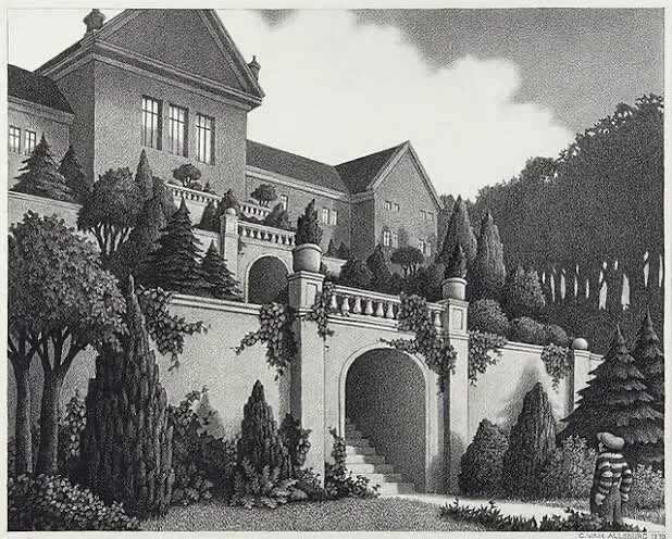
CHRIS VAN ALLSBERG THE GARDEN OF ABDUL GASAZI
Chris van Allsberg is a master of linear perspective, but that doesn’t mean everyone has to be. Some people are natural geniuses when it comes to linear perspective, but many are not. Some people have classical training in linear perspective, but many have not. Does it matter in terms of picture-book illustration? No, it does not.
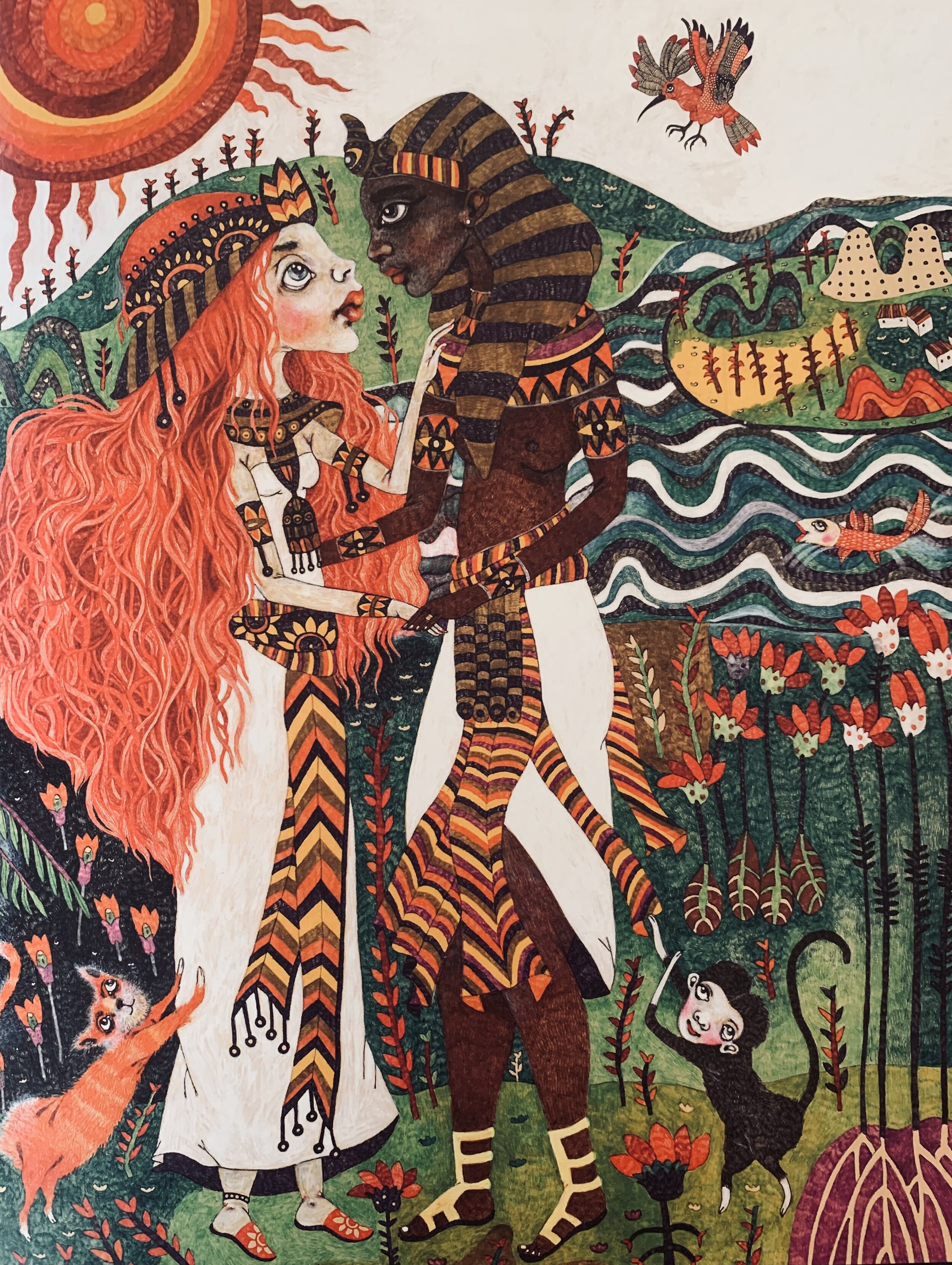
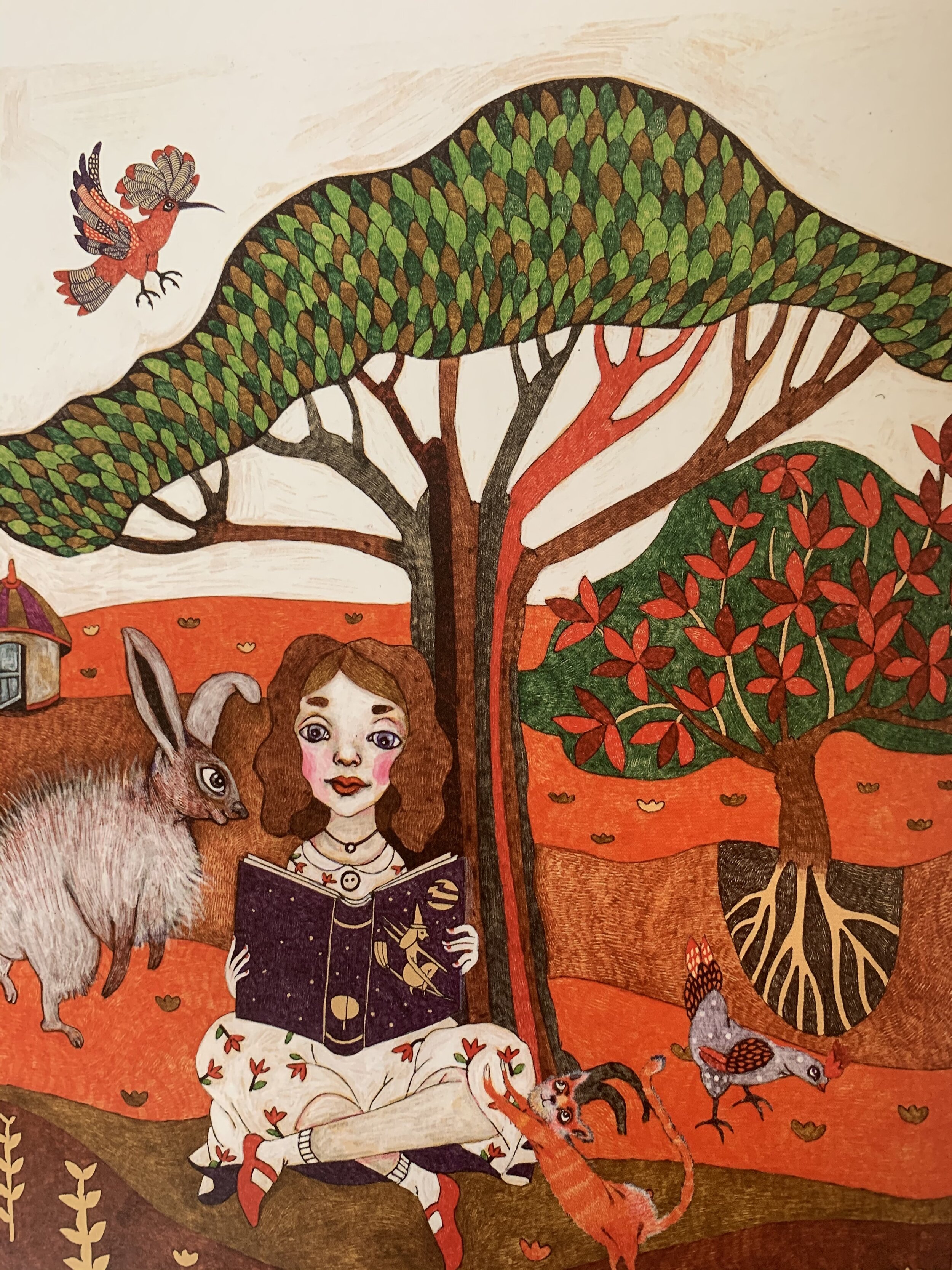
In fact, tossing linear perspective out the window is one great way to create a signature illustration style that exudes verve and confidence, and demonstrates that you know there is more than one way to skin a cat. Look at Iranian illustrator Marjan Vafaeian’s illustrations for Cinderella of the Nile (Tiny Owl 2018) below to see how she breaks all the rules of perspective, flattening the landscape and stacking landscape elements vertically, using pattern, texture, colour and tone to demarcate different areas of river, field, forest and garden. (I also elaborate a little more below about the Persian influence on contemporary Iranian illustration.)
How to Be Bold About Perspective
If you have not been trained in linear perspective, or if you have not filled sketch-books with your own diligent studies of vanishing points and how they work in every situation (including multiple vanishing points), it is possible you might be interested in exploring some elegant alternatives. You might also be delighted to know that, should you choose these alternatives, you’ll be embracing techniques used by some of the greatest and most influential artists and art movements in the history of art.
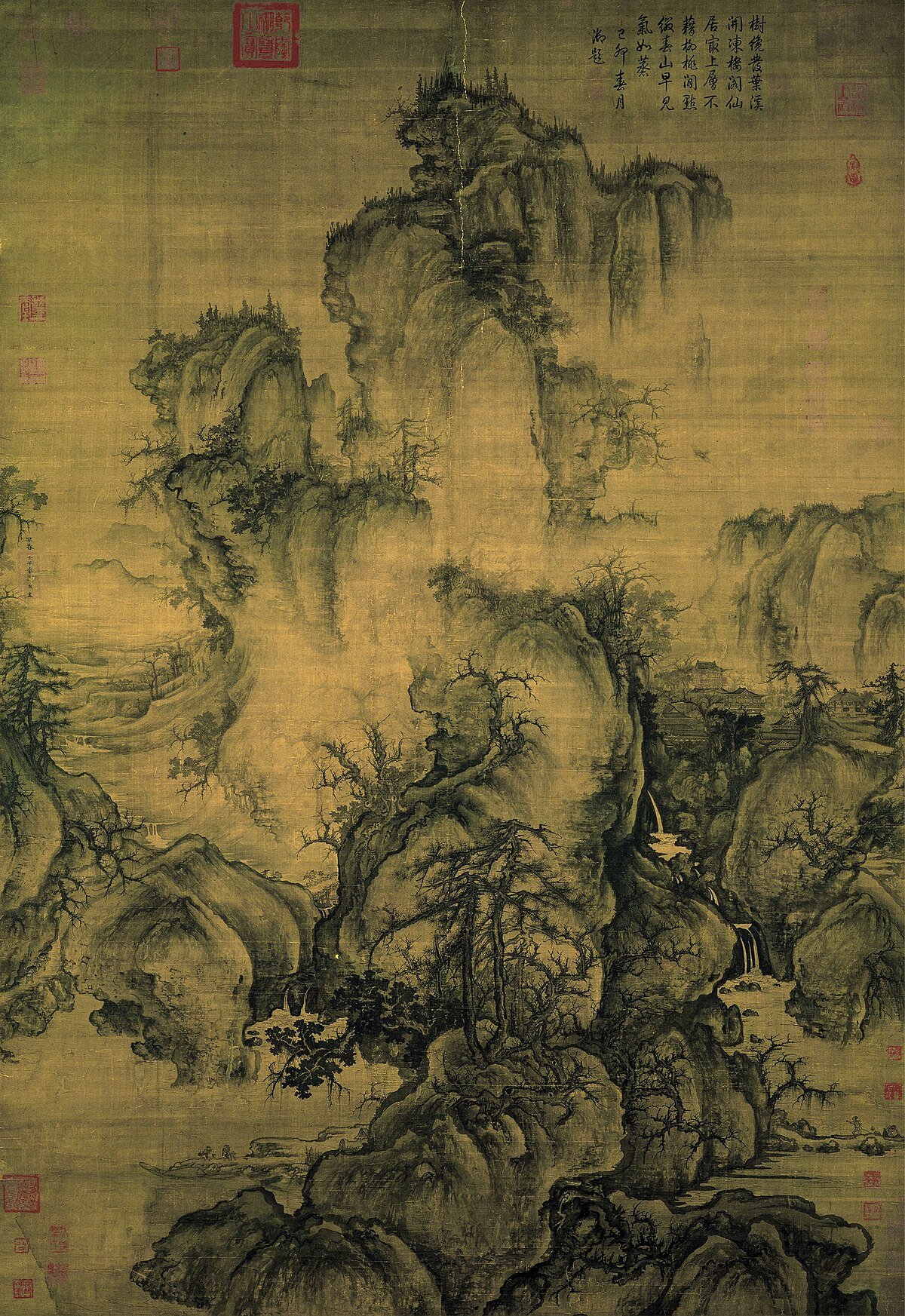
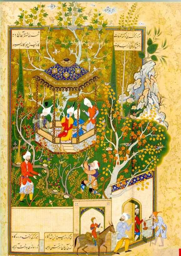
If you look at the three images below, you will see none of them have applied the rules of linear perspective. Guo Xi’s Early Spring (far left) was painted in 1072, during the Sung Dynasty, and is his most famous work, still venerated and admired and copied a millennium later. A City Dweller Desecrates a Garden (centre) is a Persian miniature painted during the Safavid Dynasty and attributed to Abdollah-e Mozahheb. Bahnhof Konigstein (far right), was painted in 1916 by German Expressionist Ernst Ludwig Kirchner. Three vastly different styles, times and cultures, but the same essential approach to perspective.
3 Alternatives to Linear Perspective in Picture Books
The main mission of picture-book illustration is to convey narrative mood in the most vivid manner possible. There are a number of techniques for achieving this vividness, and being able to draw linear perspective is not one of them!
Here are three ways of expressing your verve and initiative without sweating the perspective:
Option #1. Do as the Chinese landscape painters did, particularly as they did when painting scrolls. To emulate this style, use a flat, vertical, cherry-picker-in-the-sky perspective (not everyone is agreed on this terminology, but it works!) so that your picture plane incorporates both near and distant scenes one above the other, with only a modicum of respect for how the real-world landscape actually might look. In Chinese scroll painting, the various vistas of landscape are either linked by winding paths, meandering streams or waterfalls, or are separated by white space in the form of mist and clouds. Caver Zhang (below) is a contemporary Chinese illustrator who embraces this approach (you will notice there appears to be no vanishing point in this image. Rather, he loosely employs what is known as parallel perspective, which Chinese and Japanese painters have been using for centuries).
Caver Zhang Youth Feelings
Option #2. Do as the Persian miniaturists did, and divide your picture plane into a grid-like composition with the same parallel perspective used by Chinese painters (and that Persian painters learned from the Chinese following the Mongol invasions), but aiming for even greater flatness. Each segment of the grid represents a different element of landscape (or indoor scene), is demarcated from its neighbours by a wall, a stream, foliage, stairs (all rendered in parallel perspective), or variations in pattern, texture and tone. Most delightful of all, figures and elements of landscape appear at the same scale relative to each other, whether they are meant to be distant or close at hand. Iranian illustrator Afra Nobahar (below) includes elements of this style of composition in her illustration, adding a contemporary twist (illustration here is from Tap, Tap, Tap, by Fatemeh Mashhadi Rostam).
Option #3. Do as Expressionism (and those who inherit its innovations) did, and flatten, distort, twist and exaggerate the elements in your illustration, rendering them from whichever angle and to whichever scale best suits the purpose of your illustration (which, as we all know, is to evoke narrative mood). Some of the best contemporary illustrators lean toward expressionism in their work, and Beatrice Alemagna’s picture books are a joyful example of how realism and correct linear perspective are absolutely not required in the creation of vivid and effective illustration. (The image below is from her best-selling picture-book On a Magical Do-nothing Day.)
As you can see, any way with perspective is perfect, so long as it evokes the narrative mood best suited to the story being illustrated.
