The Power of Shadows in Picture-book Illustration
If you want to make your illustration gripping and memorable, pay attention to the shadows.
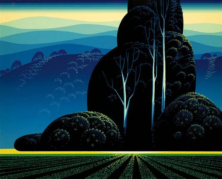
“Silent Meadow”. This work is by Eyvind Earle, whose decorative, compositional and moody use of shadow is legendary, and whose works I exclusively use for this post.
Shadows grab us in the most primal recesses of our brains. They do this so secretly we sometimes don’t even notice it is happening (though who doesn’t feel a gentle thrill at the sight of dappled shade?). Illustrators who know how to play with shadow know how to create mood, and when you can create mood you create a memorable story.
Where there is no light, there is nothing to see. Where there is light, there are always shadows. Shadow reveals form. Shadow reveals three dimensionality, texture and depth.
Using Shadow to Generate Time in Illustration
Shadows in picture-book illustration can indicate the source of light and also the quality of that light. Is it the sun, source of all brightness, brighter than which there is nothing in the natural world? Is it a candle, the moon, an electric bulb? Is it a single light-source, where shadows all fall in the same direction, or is it ambient light, where shadows are blurred and ambiguous? Is it an overhead sun, a setting sun, a summer sun or a winter sun? How we use light not only suggests time, but enhances the sense of place.
“Morning Fog” - long deep shadows against the fresh brightness created bya newly risen sun, with vestiges of dawn and night still lingering as shadow.
“Eventide” - a mysterious and evocative work … where is the light source?
Placing shadows in your picture-book illustrations can tell your viewers all of these things. With each of these light-and-shadow variations you can also create each picture’s own unique mood. Not always a distinct mood because mood can be overwhelming. But mood is also subtle, so subtle we often don’t realise we are experiencing it. Yet we can’t escape mood any more than we can escape emotion … or shadows.
Shadows are physics in action, and moods are biology in action, and between them they can generate powerful visual storytelling.
“Winter Quiet” … This image is an exciting visual exercise in contrast. Starkly bright against boldly dark. Organic forms against angular, vertical against diagonal, fine detail against blank space, hard triangles and soft columns. Note how shadows under the eaves of the barn are far darker than the shadows in the snow, but the same deep tone of the shadow on the bark of the trees.
Illustration is all about predicting and guiding the responses of your readers. Some may say it’s about instructing and informing, and it certainly can be. But instruction and information fall on deaf ears if they are not served on an elegant platter of emotion and mood. Memory and emotion go hand in hand.
Shadows are pools of darkness and mystery. The darker the pools, the deeper and more thrilling the mystery. Are your darks dark enough? There is always scope for a deeper shadow somewhere in an illustration. Especially when contrasted with points or stripes or patches or swathes of brightness. Shadows are everywhere. We are swamped and surrounded by shadows. The gloom under a table, the dark side of the house at sunset, a city street where the sun struggles to reach except in the gold of early morning. The puddle of shadow underfoot at high noon.
“Grazing in Peace” - puddles of shadow underfoot at high noon.
Without shadows we rob our readers of the secret thrills that make an illustration delectable. Without shadows, we are forever illustrating an overcast day. An overcast day generates its own mood, and it has its place in many narratives … but is an eternal overcast day the right mood for our story?
Life is rich with shadows. Play with shadows. Embrace the shadows. Always remember the shadows. The more intense the shadows, the more delicious they are. And the more intense the shadows in your illustration, the more delicious the picture book will be.
I haven’t yet been able to source the title of this painting … but here Earle plays with diagonals, using thin strips of bright light to emphasise one direction and wide stripes of deep shade to emphasise the other.
About the artist, Eyvind Earle, Amazon says: “Graphic but mystical, vibrant yet enigmatic, the work of American artist Eyvind Earle is a treasure trove of subtle and shimmering contradictions. From fanciful backgrounds for Disney classics such as Sleeping Beauty to bold experiments in multimedia art, from ambitious commercial animations to lush and otherworldly oil landscapes, Earle's oeuvre never fails to please the eye and engage the imagination.”
You can read more about him here
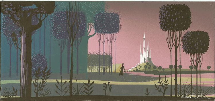
Sleeping Beauty concept art. Eyvind Earle was the innovative genius behind the visual concept for Disney’s original Sleeping Beauty.


