The Incredible Simple Secret to Powerful Illustration … that Absolutely ANYONE can Master
I'm recklessly cutting right to the chase here. I'm jumping in with a bold proclamation and a hands-on experiment that may seem super-obvious to you, but that pretty much underscores anything and everything I will ever say about quality picture-books.
It's all about TONE! And I will come right out and say it: there is only ONE WAY that illustration confers true emotional and narrative power.
Light and dark!
Everything else is secondary. Important, of course, but also secondary.
Remember that thing we sometimes said as children during those terrible struggles for social dominance in the playground?
"It's not what you said, it's the way that you said it!"
This is as true of illustration as it is of playground politics. It's not what (or how) we draw, it's the way that we draw it. By which I mean:
IT'S THE TONE WE USE THAT MAKES ALL THE DIFFERENCE.
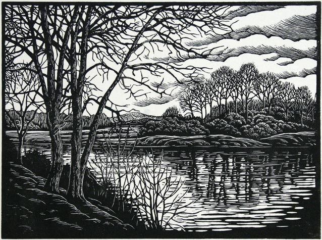
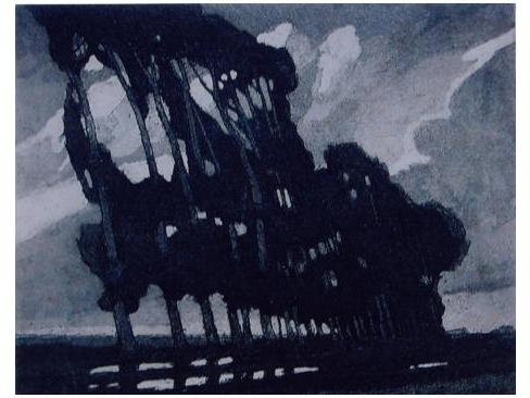
(Top) Paul Gentry, (middle) Eugene Lucker, (bottom) Fran Preston-Gannon.
YUP! TONE REPRESENTS THE VIBE (OR THE AESTHETICS) OF THE THING ...
Do you like the pictures above? Do you FEEL them? Does a little tremor of thrill pass from your brain to your blood and bones with each of them? Do your viscera tremble? And does each little tremor and tremble have its own slightly unique flavour? If you felt it, you were experiencing the breath-taking flavour of aesthetic response. Every quality work of art - be it fine art or illustration - ideally evokes feelings like this in us. And this includes illustration. Most ESPECIALLY, it includes illustration.
In quality picture-books, an illustrator will manipulate light and dark to produce specific emotional responses. Shaun Tan is, of course, one of the best at this ...

Shaun Tan The Arrival (Hodder 2006)
And guess what, we can all achieve it. Including secret, not-very-talented scribblers like myself.
(Also, just acknowledging, lot's of people do understand the wonderful truth about tone. But quite a lot of people don't! Like I didn't, until a few years ago. Which makes me a Born-again Tonalist, I guess.)
HANDS-ON SUPER-SIMPLE EXERCISE
I used to struggle with what was or wasn't working in any given illustration. Quite often, if something seemed to be missing, I wouldn't be able to put my finger on it. But after many years of working with wonderful illustrators and reading up on the aesthetic properties of great art, I discovered the secret of TONAL VALUE. Now I am a fanatic ... in the nicest possible way, of course.
So I know that this one simple and immensely satisfying exercise can revolutionise the way we think - and feel - about illustration.
- take a graphite pencil and create a very simple drawing of a tree
- shade the background dark, leaving the tree white
- if we think we have made the sky dark enough, we probably haven't ...
- so shade the sky EVEN DARKER
- NEXT ... recreate the same simple tree
- ... and shade the tree and ground REALLY DARK while leaving the sky light ... just like Rembrandt did in the picture below.
- Play with the tones, but maintain the contrasts
I don't know about you, but for me the two variations of this same simple image convey completely different moods. Isn't it FUN? (Or am I just being geeky?)

Three Trees by Rembrandt
We can do this experiment to revolutionise any drawing: make some parts REALLY DARK, and leave other parts light. Depending on how much of the drawing is dark and how much is light, and depending on where the dark bits and the light bits are on the page, will dramatically affect the mood of the images.
You see? Revolution!