How horizons strengthen visual narrative in illustration
Monk by the Sea by Caspar David Friedrich
WHERE THE SKY TOUCHES THE GROUND
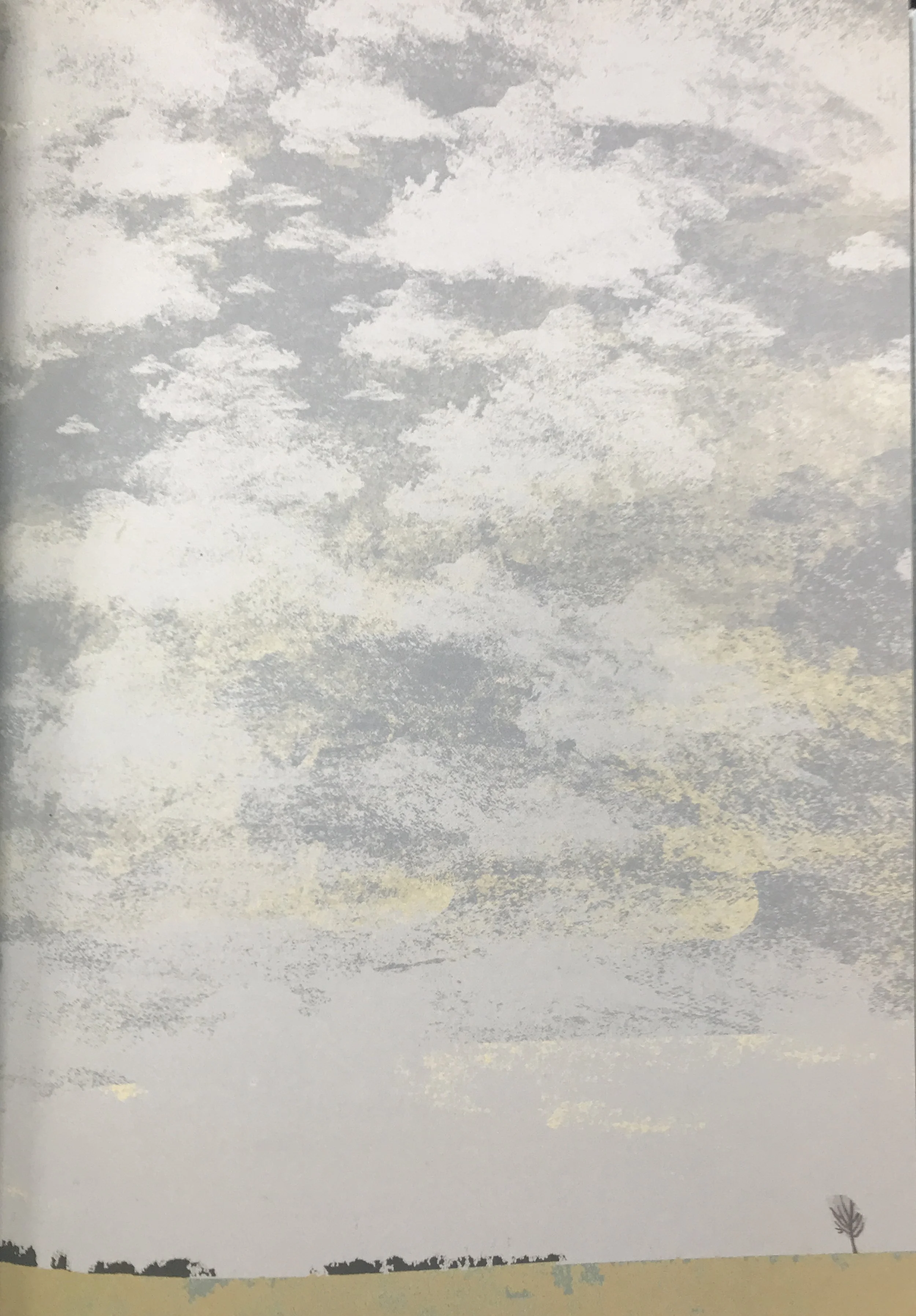
Recently, when swiping between a series of three pictures by Britta Teckentrup I had posted, editor and publisher Alyson O’Brien said, “I could actually FEEL my brain cogs adjust slightly with each one.”
This is what happens when we look at art: art plays with our brain cogs. Many elements in a picture can adjust our cogs, and a great many of these elements slide into our consciousness completely under the radar. The position of a horizon, for example, can affect our brain cogs without our knowing it is happening, and can furthermore affect our emotional and aesthetic response to a narrative sequence. Judicious manipulation of horizon placement can set the mood for an entire picture book. But how much thought do we put into horizons, either as illustrators or viewers?
(Below) Britta Teckentrup Look at the Weather (2015, 2018)
As illustrators, do we ponder how low to place a horizon on the page, do we avoid the centre, do we experiment with a horizon so high we show only a sliver of sky? Or perhaps we decide to show no horizon at all? As readers, do we notice the humming undercurrent of mood that pervades our unconscious experience of a narrative, and do we ever stop to consider how the position of horizons in the illustrations might contribute to this effect?
WHAT IS HORIZON … REALLY?
Clearly, horizon is where the sky touches the ground.
But in an artwork, a horizon is also a demarcation between one tonal value and another. A white ground against a dark sky, and dark ground against a bright sky. The position of the horizon furthermore determines the proportions of tonal value on a page: mostly bright, or mostly dark, or subtle mid-tone against subtle mid-tone.
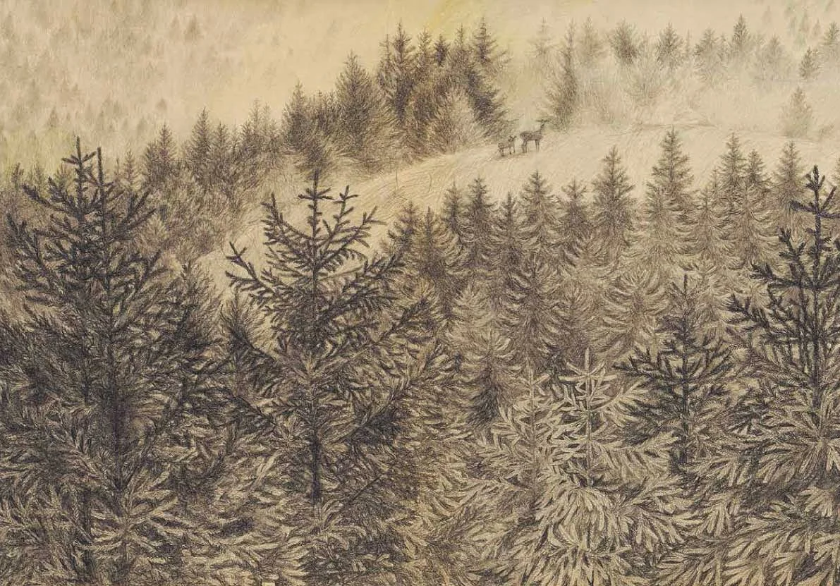
Joanna Concejo (below) plays with horizons in C’era Una Volta Una Bambina (Topipittori 2012) to evoke a range of ambiguous responses in her readers. The first image show no real horizon: there only seems to be a horizon … until we realise we can’t see sky, only more and more forest. The demarcation between horizon or not-horizon is vague, and our sense of place is simultaneously ambiguous. Is there an edge to this forest or does it go on forever? In the second image the horizon is unambiguous, set low on the page and starkly dark against a lighter dusk sky (cloud watchers, note also the cloud). We see the difference between sky and ground, but this picture is as unsettling as the one above it. We don’t trust the darkness of that sliver of forest ...
Two dramatic treatments, two vividly different narrative moods.
Gut reaction to illustrations
While our brain cogs respond emotionally to demarcations between ground and sky, our physical bodies react viscerally. We have actual, real and true gut-reactions to the things our eyes perceive. And this is most especially so when it comes to the interplay of what we perceive. Our eyes have evolved to respond to areas of bright and dark before they respond to anything else. More importantly (to both life and aesthetics) our visual neurons respond to relationships between brightness and shadow, especially changing relationships.
The retinal analysis of light relationships makes sense evolutionarily: a frog that senses a looming shadow is wise to jump away. In illustration, changing relationships between bright and dark make sense aesthetically: a viewer offered a new tonal experience on each turn of the page - especially if those experiences gradually build towards a meaningful narrative mood - is a whole lot more likely to feel aesthetically satisfied by their experience of the book. Horizon placement can help achieve this effect.
(Below) Images by Britta Teckentrup from Look at the Weather
Depending on the mood we want to create, we can place horizons high or low, manipulate areas of brightness against areas of darkness, or juxtapose two areas of similar tone to evoke a whole spectrum of subtly nuanced narrative moods.
No matter our level skill, a judiciously positioned horizon line can transform the power of an illustration.
Illustration by Shaun Tan from The Rabbits by John Marsden.
HORIZON MAKES A DIFFERENCE
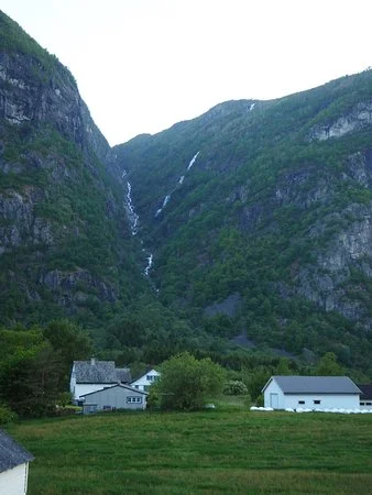
Once, when visiting Norway, I travelled by bus to a remote town at an innermost reach of a steep fjord. Granite cliffs a thousand metres high loomed close on either side of the narrow arm of water as the bus wound carefully along the edge of the fjord.
The bus was mainly full of high-school students on their way home, all glued to their smartphones. ‘You guys!’ I said inside my head. ‘Can’t you see where you are LIVING? Your world is astonishing! Look out the windows!’
But of course, if one’s permanent world is a steep one, a sliver of misty sky peeking between towering granite bluffs may not be such a thrill. Living in such a landscape, one might long to visit a flat world where the sky comes all the way down to the ground.
Which is exactly my point.
Horizons make a difference.


