The Dramatic Power of the Very Small and of the Not-There-At-All

From Le Petit Garcon de la Foret by Nathalie Minne (Casterman 2012)
Bigger is better? Nope! The larger it looms, the more impact it has? Not necessarily. The louder it bellows the more exciting it must be? Probably the exact opposite. Let's not be fooled by largeness or loudness, wherever we may be looking. The most dramatic things often come in tiny packages, and that includes drama in narrative illustration.
In this post I ponder favourite illustrations that say a LOT by saying very LITTLE. To be more precise, illustrations that say a lot about the main character, without giving that character much real estate on the page, if any at all.
The Joy of Springtime
Look at the two young people in Nathalie Minne's picture above (yes, indeed, I may have mentioned this book before, and I may well mention it again because it's brilliant). There they are, those two little boys, revelling in the blossomy beauty of springtime, perched high on a twig and themselves so twig-like in size, shape and colour that they are almost invisible. And yet, thanks to Minne's mastery, we feel a surge of the same joyous wonder they are feeling, and perhaps almost imagine a whiff of the same springtime scent they are sniffing, and feel the tickle on our cheeks of the same whisper-soft petals.
We don't need a nice big smiley face suggesting in a nice big obvious way that SPRING IS FUN AND BLOSSOMS SMELL GOOD. We get that the boys love spring because Minne has found a way for us to feel the subtle and multi-layered wonder of it for ourselves.
The Drama of the Almost Invisible

Illustration by Joanna Concejo from C'era una volta una bambina by Giovanna Zoboli (Topipittori 2015)
I examined C'era una volta una bambina very closely for a thesis I wrote a couple of years ago (it is the story of Little Red Riding Hood, told in the most novel and unusual and gritty way possible - I could ramble on forever about the brilliantly innovative text), but I didn't see what I was SUPPOSED to see in this picture for quite some time.
My attention was repeatedly drawn to the village of little scattered houses, to the couple of miniscule figures and tiny dogs going about their distant business, and to the lone cottage at top left, which I supposed might have been where the grandmother lived, maybe, but not sure, and was therefore amusing to wonder about. It was pleasant picture, all in all, a bit of a scene-setter telling us, 'Well, look, here is the charming village where Red Riding Hood lives, and here is her grandmother's house, maybe, and if you turn the page the story might get more interesting'.
But WAAHHH!! What is THAT!?
Suddenly the picture is EXTREMELY interesting. Because suddenly I see two pricked ears at the bottom of the page. Suddenly the mood changes from charming to ominous. Suddenly the village is UNDER SURVEILLANCE. Not by me, the mildly curious reader mapping an imaginary path between the trees, but by a wolf: a wolf watching the village far below, ever-so quietly, calmly, alertly, and with ever-such quiet INTENT.
Just two pointy ears amongst a forest of pointy trees.
But what delicious MENACE there is in that Almost-Invisibleness! The sleepy village is no longer a haven, but a trap. Someone is watching, someone is keeping track of what they do and where they go, someone will know the minute a certain person leaves the house.
All our most paranoid fears are encapsulated in those two tiny triangular shapes at the bottom of a large and otherwise benign landscape.
The take-away lesson? Fear in a handful of dust, as TS Eliot promised.
The Drama of What Has Not Even Happened Yet

(c) Rovina Cai
There is nothing like suspense for getting the heart-rate up.
When this image was shown in an exhibition I curated in 2016 (Scapes: The Sublime in Narrative Illustration), it was everyone's favourite, from the completely young to the completely venerable. As one person said, 'I love it. Because I hate it'.
Why did she hate it? Because something ghastly is surely about to happen, and because it is going to happen sometime really soon. Because the little hut nestling against the forest edge SHOULD be a place of safety and haven after a long trudge through the snow, but clearly is NOT. Because the two figures are slogging their way through deep snow TOWARD the hut when they should be running AWAY. Because the figures are OBVLIVIOUS to what is lurking in the trees. Because the trees-that-are-not-trees are closer to the hut than the figures are, which means ... which means ...
We don't know what is going to happen, but we DO know whatever happens will not be pretty.
And how has Rovina done this? By making the characters small, small, small. By facing them away from us, the viewers, which makes them seem doubly vulnerable because we can't communicate with them. By making that hut so small and in such imminent danger that it is impossible for it to suggest refuge, and yet our subconscious minds shout 'Quick, run inside and shut the door, because it is a HOUSE, and houses are SAFE!' ... and yet this action would be palpably disastrous.
And, of course, by hiding a pack of wolves and some nasty, beaky, squawking, pecky birds in the trees, and by there actually being absolutely no trees at all, whatsoever, anywhere.
Ambiguity and dissonance abound ... danger lurks where safety should be, threat where there should be refuge ... and that is why everyone loves this image, and love it because they hate it.
The Drama of the Unbelievably Small
Matt Ottley is a master of illustrative drama. Scale, proportion, contrast and point of view are his specialties, and he manipulates them so expertly that his artworks draw us in and almost overwhelms us.
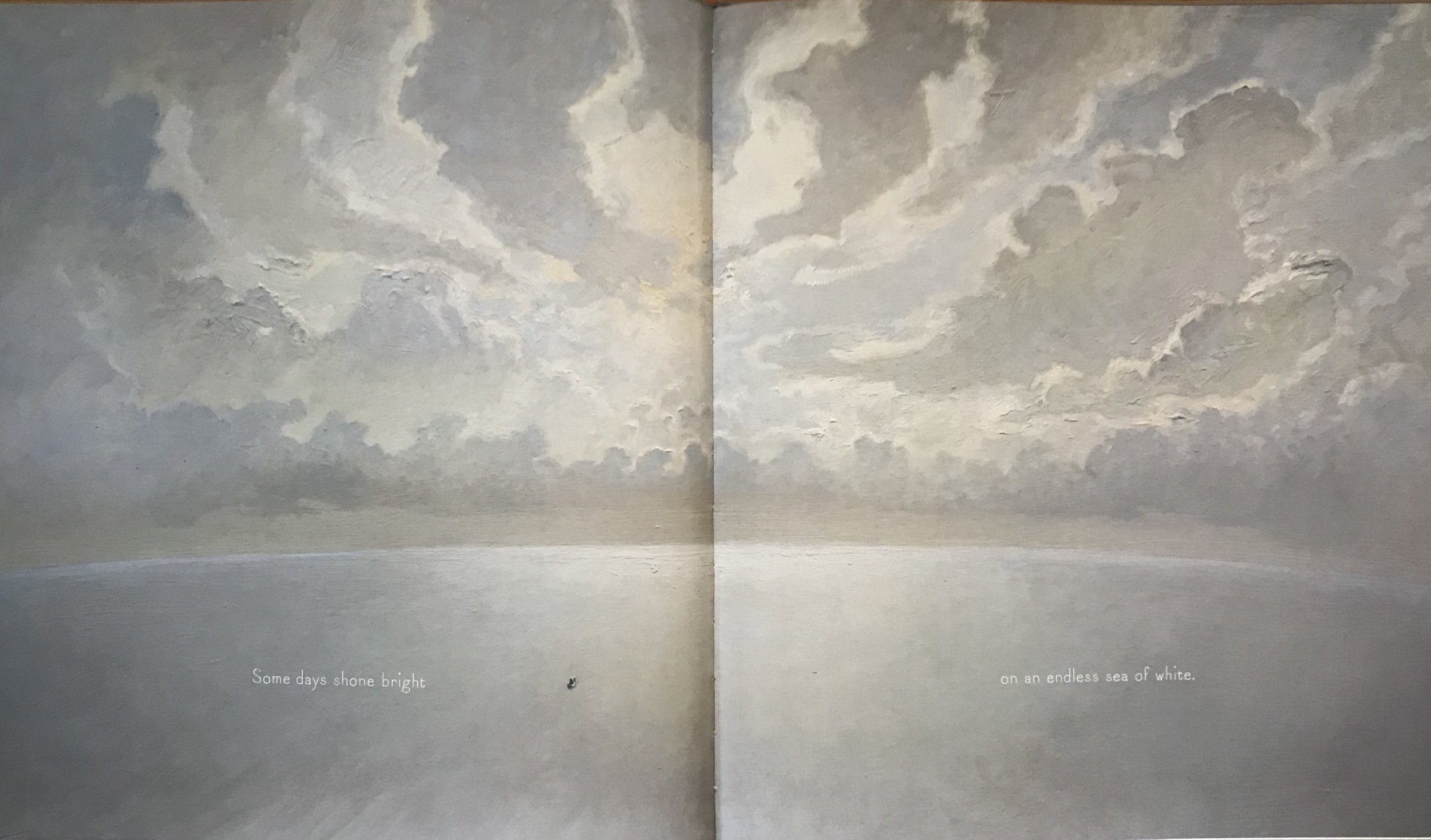
Illustration by Matt Ottley from Teacup by Rebecca Young (Scholastic Press 2015)
That little speck on the left-hand page is not a crumb from my breakfast. It is a boy in his boat. What could be more dramatic than this minisculeness counterpoised against vastnesses of endless ocean and sky?
The Drama of Not There at All
Sometimes, when it comes to suggesting the bleak, the ghastly and the harrowing, it works best not to show people at all. Landscape wields enormous emotional power, far more than we give it credit for, and a picture of unpeopled landscape - good or bad, happy or sad - can pack more narrative punch in a picture book than any number of emoting faces. Showing nothing but landscape shoots primal darts straight to the subconscious heart of the reader, and it takes a wise and masterful illustrator to know exactly how and when to do this.
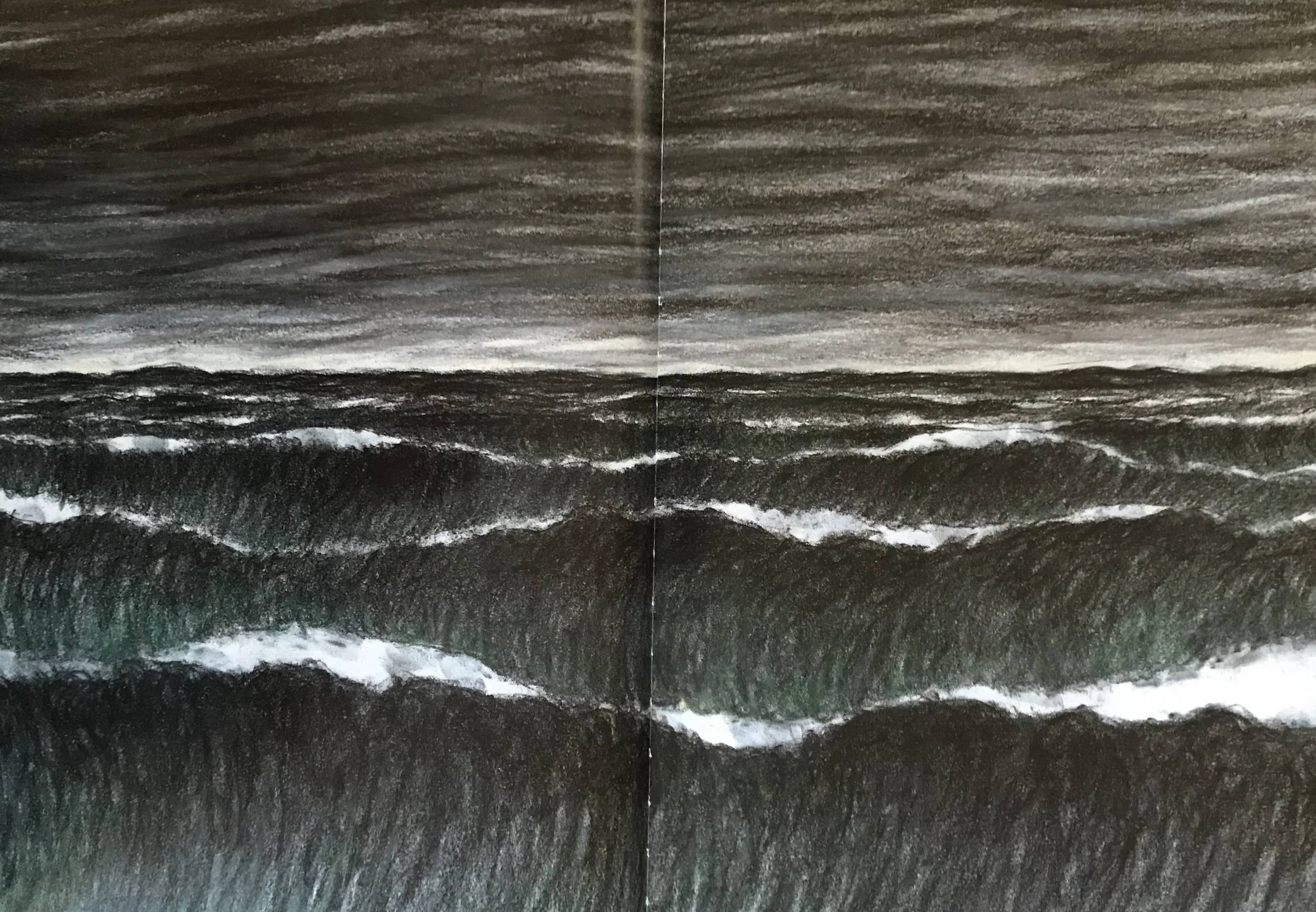
Illustration by Armin Greder, from The Island (Allen & Unwin 2007)
Armin Greder is one such master. Whenever I look at this picture (above) I feel the burn of salt water in my stomach, the rasp of sand in my throat, the sting in my nostrils, the weight of waterlogged clothes dragging me down. The endlessness of ocean. The hopelessness. The implacable, amoral, relentlessness ... Oy vey! Now I am PROPERLY depressed ...
See how well it works?
The Drama of All About Something Else
Just quickly ... because we must all be getting weary by now ... here is a flashback to the middle of last century and one of the GREAT illustrators of the time, Charles Keeping. His illustrations were everywhere: historical novels, contemporary picture books, illustrated classics. Now his legacy has vanished, but he could DRAW! And he could draw DRAMA.
I'm not showing you his proper gory drama here (he did good gore, with blood coming out of necks and everything), but his quiet drama: the stately, measured drama of passing centuries, and the stately, measured drama of a river, which sometimes you see, and mostly you do not. This drama unfolds in a wordless picture-book called River, but it is less about the river itself and more about the drama of the people who live, work, suffer, enjoy, build and destroy their way through the centuries on the river's bank. The story is about progress, development and change, and about continuity.
River is beautifully luminous. It is, of course, out of print. Here is the river as we first encounter it ...

River by Charles Keeping (Oxford University Press 1978)
And here is the river as we find it later in the book ... not there at all, but quietly present, nonetheless, on the far side of that impenetrable brick wall. What genius, to evoke the majesty of an eternal river, simply by not drawing it.
